Tuesday, April 5, 2011

Week 12: First Draft of Digital Painting

Craft
These are my first draft of my digital paintings. I made this by using and creating pictures of bikes and bike parts, using Photoshop, then making my own brushes. There were many steps involved in creating this. The first step was creating my signature stamp. This was done by using the brush tool or pen. Once I wrote my name, I preset it as a brush. Next, I had to take pictures of bikes and bike parts such as the wheel, horn, and bell. Once I had my pictures, I needed to crop them in order to make a new brush. I used the rectangular marquee tool, polygonal lasso tool, and the eraser tool. Once I had six cut outs of bikes and bike parts, I defined them as a brush. Making the last two bikes, I made a bike and a wheel using the rectangular marquee tool, elliptical marquee tool, and the brush tool or pen. I defined them as a brush as well. Once having all the brushes I had to create a new document and combined all the brushes together to create a collage with bikes and their parts. Once I finished, my signature brush was added.
 Composition
I arranged things this way using because I used different values of my two hues and order of layers. Before I could define each bike cut out as a brush, I needed to adjust the brightness and contrast to separate the blacks from the whites since it was created using grayscale. When creating my new document, I made sure it was a 300dpi RGB document. Once I had this document, I created ten layers. On each layer I put one of my bike brushes I recently created. Each layer had one bike brush. I used two hues, blue and green, but used different values of them for each stamp. I also used scale to make some of the brushes on one page smaller while others were bigger. When making each layer, I turned off every layer except the one I was working on. Once I had all ten layers created, I turned on and off layers to see what stood out the most. For the first painting on the left, I arranged things this way because the viewer is able to see not only the bike but also the bell. I am controlling the viewers’ eye by using layer order and different values. The bikes stand out the most because they have a darker hue but the bells also stand out because they are large in scale. The viewers’ eye is drawn to either one of these. For the second painting on the right, I arranged things this way because the viewer can see the wheels, baskets, and also the bikes. I am controlling the viewers’ eye by drawing their attention to the lighter hue baskets which I think stands out the most. The viewer can see the large scaled one but also the small scaled ones. Once my signature was added in a completely different hue, pink or red, the viewers’ eye is also drawn to that because the color greatly stands out.
Concept
These are digital paintings I made using my bike brushes. They don’t really mean anything because they are just a collage of random bikes and bike parts. I am trying to say that by using two hues but different values within them, it can really make one item stand out the most. Turning off the layers also helps when trying to make a painting using only two hues. I am also trying to say that you can make anything into a brush.

Week 11: Paintings and Drawings


Craft
The image on the left is of two tea pot drawings. The image on the right is of five paintings. I made both of these images using Photoshop. The necessary steps in creating these images were very different. The tea pot drawings were much easier to create and had fewer steps to follow. I made this by first using only the pen or brush tool. I made the tea pot on the right first, using the brush tool. As for the tea pot on the left, I changed the type of brush to the Smoke Brushes. Starting off with black I changed the colors to red and yellow using the paint bucket tool.
For the five paintings, the necessary steps were first by using the brush tool as well. When picking new brushes, I clicked the Brush Preset Picker down drop which gave me various brushes to choose from. Once I chose a brush type, I clicked Append which combined all of the brushes. After creating five paintings of different brushes combined together, I titled each one. Starting at the top left, the paintings titles are The Love for Crazy Music (different actions of people with music notes and hearts behind them), Army of the Birds (looks like the birds on the bottom are stern soldiers and are attacking the other birds who are hiding behind the flower fences), Mama Leaf (large leaf with little baby leaves surrounding it), Subliminal Messages (looks like the bubbles are covering hidden words), and Paint Over My Heart (the paint splatters are covering the mini hearts).
                The similarities between the paintings and drawings were that the brush tool was used. The difference between them is that the paintings consisted of using only different brush stamps while the tea pots used only the Smoke Brushes and the other tea pot was made by using the pen.
Composition
For the tea pot on the left I arranged things this way by using layer order. I used three different layers which were all arranged to look like the tea pot I was giving to create. The first layer had the tea pot made with the smoke brush in black. The second layer was made with the smoke brush in red and the third layer was made with the smoke brush in yellow. I arranged things in this order because the black stood out the most on top. It also goes from darkest to lightest, black to yellow. I am controlling the viewers’ eye by drawing their attention to the darkest tea pot which is the black one on top or in front. The viewer notices the red and yellow but the black stands out the most. I think the viewers’ eye is also drawn to the very bottom of all three pots because it has the ends of the smoke brushes which are very sharp and pointy. For the tea pot on the right, I arranged things this way by trying to use only vertical lines. I used larger lines for bigger parts on the pot and smaller lines for the lid and bottom of the tea pot. I am controlling the viewers’ eye by making many lines which shows more definition. It’s basically a repetition of vertical lines. Their attention is drawn to the many lines.
For the paintings I used a mixture of pink and purple hues, changing the value in each. For the painting, The Love for Crazy Music, I arranged things this way by also using layer order. The people, being the most important were placed closest to the viewer. The hearts were farther away because they were less significant. I arranged the people this way because I wanted to include different people doing different actions but having them all be noticed. None of them are overlapping or are hidden. I am controlling the viewers’ eye by having the people in a higher value of purple. This makes them stand out on the lighter pink background. The Army of Birds was arranged this way with layer order. The birds in front showed more dominance because they were all together. I added the layer with the flowers because it seemed as if it were a fence, covering the birds behind it. I am controlling the viewers’ eye by drawing their attention to the higher value of pink birds that are all together and also to the flowers that are all stuck together. Mama Leaf was arranged this way because I wanted to use different scales of this one leaf. They are all of the same hue and value but their scale is different. I made one large one to show dominance and a lot of smaller ones to show they are surrounding this large one. I am controlling the viewers’ eye by drawing their attention to the one largest leaf. It overpowers the smaller ones. Subliminal Messages was arranged this way by using layer order and having the bubble layer on top because it seemed to cover the other layer in a way that was making the layer underneath blurry. Although there are not words or letters underneath, when first looking at this it seems as if they are actually words hidden. I am controlling the viewers’ eye by drawing their attention to the lower value of purple behind the higher value. This stands out. The viewers’ attention is also directed towards the few white patches. Paint Over My Heart was arranged this way because the paint splatters have a higher value of pink which completely covers the heart background. This is also how I am controlling the viewers’ eye. Their eyes are drawn towards the dark pink splatters. They are bright and in front which shows their dominance.
                The similarities between the painting and drawings are that layer order was used and they used different hues. The difference is that the drawings were only arranged to look like a tea pot while the paintings consisted of different arrangements of brushes and layers which allowed for many different arrangements.
Concept
                For the tea pots, these are simply two different paintings of the tea pot that I was looking at. It doesn’t have meaning because it is just a tea pot. I am trying to say that by using any type of brush, you can create, for example, a tea pot. For the five drawings, they are just different brushes combined together. I think that their meaning is in their titles. Their titles are what I believe the brushes and layers together mean. I am trying to say that just by turning on or off a layer and having a wide selection of different layers; you can create a variety of combinations. Not one painting is the same because there were so many different layers that had different brush stamps on them.
                The similarity between the paintings and drawings is that I am trying to say that by using the brush tool, many different things can be created. The difference is that the tea pots don’t really have meaning while the paintings do.

Monday, March 21, 2011

Week 10: Digital Version of Sketches 2

This is the final version of my digital sketch. I made this by using Photoshop and also by listening to other peoples’ opinions on how they seen and interpreted my sketch. There weren’t many steps because I basically had everything made from my previous sketch. First, I made a background behind the tunnel the person was escaping from. I made this by using the rectangular marquee tool. I made the tunnel or escape route longer by using the polygonal lasso tool. I made more music notes and arrows by using the custom tool shape. I changed the direction of the arrows and the person by rotating them. The colors were added by using the paint bucket tool. I arranged things this way to make it seem as if the person is escaping the ordinary or older radio to get to the newer radio which has on 88.3. I added a layer style to the newer radio and the tunnel by using Bevel and Emboss, changing the structure by increasing the depth and size and softening it. I moved the barbed wire fence and made it smaller by using scale. I moved the layer on top of the older radio layer. I also moved the person who is escaping and the white “explosion” the man is escaping from. This layer was placed on top of the fence so it stood out more and showed the most importance. The person dancing was also moved to the newer radio where he is shown dancing to 88.3’s music. There are white music notes coming from the older radio to show plainness, and there are colorful music notes by the newer radio to show uniqueness. I am controlling the viewers’ eye by making the newer radio, which has 88.3 on, bold, large, and colorful (bright colors). I am also controlling the viewers’ eye with the arrows. They follow them up to the bright radio which has 88.3 in bright red. This is my final version of my digital sketch. This means that this is my interpretation of the escape from ordinary radio. I am trying to say that this version relates to 88.3’s slogan, “The Escape from Ordinary Radio.”   

Sunday, March 20, 2011

Week 9: Digital Version of Sketches

This is my digital version of one of my sketches. I made this by using Photoshop. The process in making this required much time and patience. The necessary steps in creating this were first making the radio where I was showing the man escaping from. I made this by using the rectangular marquee tool and also the elliptical marquee tool. Creating the radio, I made different size rectangles and then adding circles for the speakers and buttons. I also added a text box into one of the rectangles to show a different radio station other than 88.3 (XX.X). Using the polygonal lasso tool, I made a place in the radio where the person was escaping from. Next, I made the barbed wire fence. I made this by using the line tool to make the top and bottom. I then used the rectangular marquee tool to make long parts of the fence. Using the pen or brush tool, I drew the top of the fence or the wire. After this, I made the path that led the person escaping to the other radio by using the polygonal lasso tool. I then made the radio in which the person was trying to reach. I made this by using the rectangular and elliptical marquee tool. I also used the text box to create 88.3 in other circle on the radio. Making the music notes and arrows I used custom tool shapes.  I used the text box again to put in 88.3 within the arrows. I also rotated to arrows to face the other way to show the direction in which the person is going. Finally, I created the people or stick figures. I used the same tools, elliptical and rectangular marquee tools. I rotated their arms and legs where I wanted them and also to make them follow the path going down. All the color was added using the paint bucket tool. I arranged things this way to make it seem as if the person was escaping the ordinary radio, finding a path to the unordinary radio, and then finally reaching it. I used many layers which allowed me to have order. I also put many layers into groups to move the whole image I created. For everything in this digital version, I used scale to make things either smaller or larger. For the speakers on the newer radio or ordinary radio, I made them pop out by adding a layer style. I increased the depth and size, and softened the structure within Bevel and Emboss. I am controlling the viewers’ eye by drawing their attention to the speakers of the ordinary radio then to the arrows which show the path the person is going down and the arrows also have 88.3 in bright red. The 88.3 in the old radio and the music notes also catch the viewers’ eye.  This is a digital version of my sketch. It means that this is my interpretation of escaping from the ordinary radio. I am trying to say that this version related to 88.3’s slogan of “The Escape from Ordinary Radio.”

Thursday, March 10, 2011

Special Edition Blog: Classical (1500-1900)


To the left is a picture of me at the Art Institute and to the right is a picture of Professor Nathan Peck, also at the Art Institute in the Classical Wing.

Craft
This painting is called Fishing Boats with Hucksters Bargaining for Fish and was created by Joseph Mallard William Turner. This is oil on canvas. Most of his career was devoted to abstract effects. He made this by his subject being derived from his exposure to 17th century Dutch sea paintings. The picture consists of men, boats, threatening and dark skies, and rough seas. The necessary steps in creating this were making enormous waves. In some spots on the waves, there are chunks of paint which I think gives this painting an abstract effect. It seems as if the waves are rough and as if the water is splashing up from them. This also gives the painting texture. In making this he created smaller boats in the back of the isolated larger one to notice the struggle of getting as far as the large boat did because of the enormous waves. He also added in people on the boat. Some are noticeable but in some spots on the boat, things are smeared or blurred but it is still possible to notice what Turner was trying to depict. Overall, I think that there were many steps in making this because of the abstract effect.
Composition

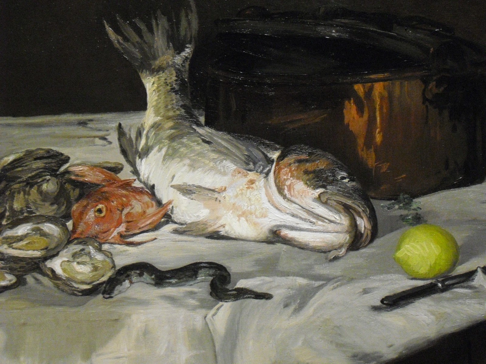
This painting is called Fish Still Life and was created by French artist, Edouard Manet in 1864. It is created with oil on a canvas and shows composition. In this painting, there is a carp, red mullet, eel, oysters, lemon, stockpot, and a knife. Manet arranged things this way to make it seem “alive,” even though the translation of ‘still life’ in French is “dead nature.” He balanced the positioning of each element in this painting. He precariously balanced the knife and still-slithering eel along the diagonal of the tablecloth to make it seem as if they were coming towards the viewer. I also think that he arranged everything in a way where the viewer can notice everything in this painting. It is close together but also spaced out just enough to notice exactly what food is being prepared and that there is only one pot. Manet is controlling the viewers’ eye by making the colors very similar except the yellow lemon. The viewers’ eye is mainly drawn to either the large fish or the yellow lemon. It also gives the viewer a sense of smell and taste by the arrangement of everything on the table. Everything on the table is normally cooked separately but this painting draws my eye to the one stockpot which makes me think of all that food mixed together.

Concept
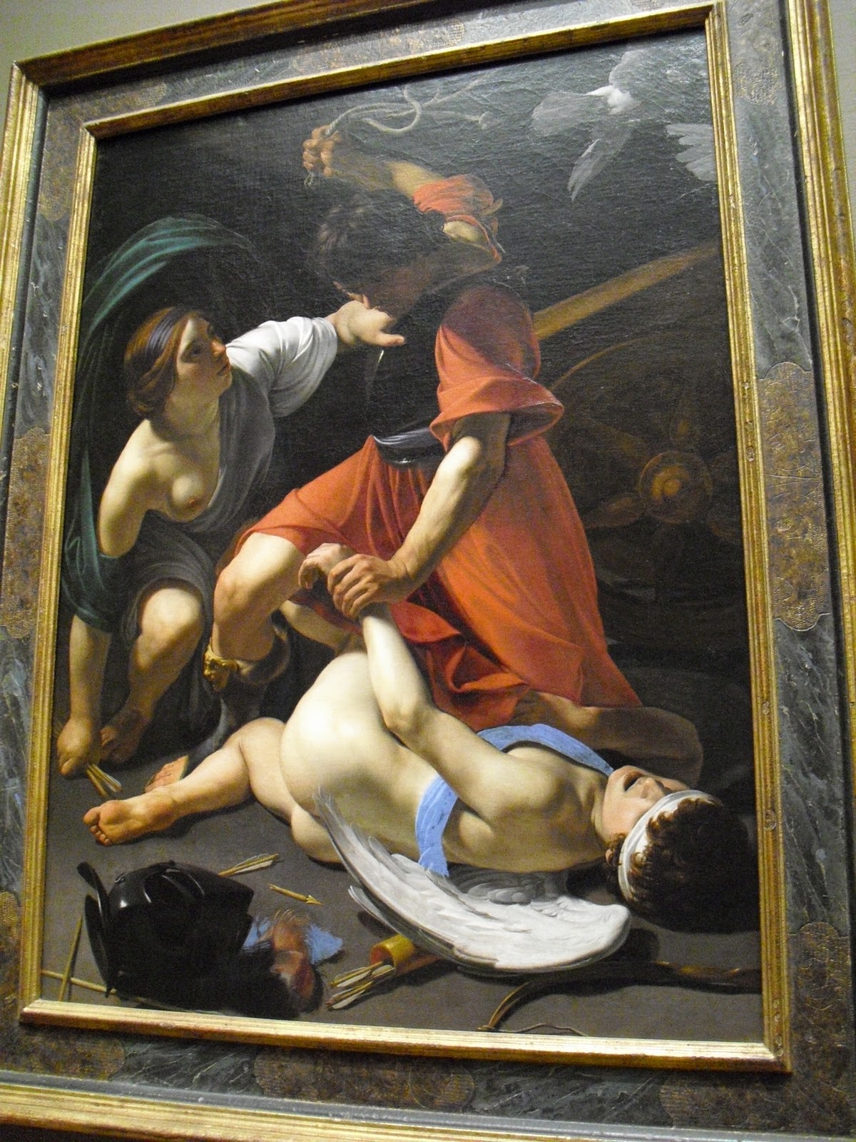
This painting is called Cupid Chastised and was created by Bartolomeo Manfredi. This is oil on canvas painting. The people in this painting are Mars (the god of war), Venus, and Cupid. This painting means that Mars is beating Cupid for having caused his affair with Venus. This exposed him to the ridicule of the other gods. Manfredi chose not to interpret stories from the Bible and classical mythology as ideal subjects but rather as events that happened, or could have happened to ordinary people. He is simply trying to tell this tale of domestic struggle which symbolizes the conflict between love and war.

Special Edition Blog: Modern (1900-2011)


To the left is a picture of me at the Art Institute and to the right is a picture of Professor Nathan Peck, also at the Art Institute in the Modern Wing.

Craft
This painting is called Head and was created by Pablo Picasso in 1927. This is made with oil and chalk on canvas and shows craft. The necessary steps in making this were fairly simple and it shows Picasso’s constant experimentation with style and technique. To make this, he painted a surface on the canvas. He laid the canvas flat and sprinkled powdered pigment, similar to Native American sand painting, onto the still-wet painted surface. In some areas he left layers of the powder untouched, making a rough surface. In other areas, he scraped the pigment off which created a flat and blurred effect. Picasso added on three different sized rectangles and a strange depiction of a head.

Composition
This painting is called Lincoln and was created by Robert Rauschenberg in 1958. This is printed paper and stamped metal with oil paint, fiber – tipped pen, and silkscreen ink on fabric. In this painting there is a photograph of the Lincoln Memorial in Washington D.C., with passages of paint and items such as a scrap of damask, a rectangle of brown wrapping paper, and an illustration of an eroded cliff. He arranged things this way because he joined found objects, postcards, and other printed materials to bond the gap between art and life. To me, it seems like he arranged it by putting the picture of the Lincoln Memorial in what looks to be a white frame then on the side has the rest of the items which can have some type of relation to the photo. He is controlling the viewers’ eye by using light hues except in the left and right corners and scale. The picture is larger than the other items but is very light and is in black and white. The viewers’ eye is either drawn to the large picture, the left corner which has yellow paint dripping down, or the right corner which has a splash of red paint.

Concept
This painting is called Ceci n'est pas une pipe and was created by Belgian Surrealist painter Rene Magritte. This painting shows a pipe with a saying beneath it. This saying is in French and it means ‘this is not a pipe’. The saying seems like a contradiction but it is actually true which is what he is trying to say. This painting is not a pipe, but rather an image of one. Magritte commented on this painting saying "Just try to stuff it with tobacco! If I were to have had written on my picture 'This is a pipe' I would have been lying."


Monday, March 7, 2011

Week 8: Sketches 2

These are three different variations of my previous five sketches. I made these by using my similar ideas but adding more detail to better understand exactly what I was trying to communicate. The necessary steps in making these were fairly simple. First I picked out my three favorite sketches from the original five in which I drew. Next, I added more detail and changed a few things. In the first sketch of all the radios, instead of putting an actual radio station, I put X's. I also made one of them have 88.3 with a smiling face which is supposed to be the speaker part of the radio. For the second sketch, I added more detail to the prisoner himself and also to the prison.  In my next version of this sketch the prison in which he is escaping from will actually be a radio. This will relate more to the slogan, "The Escape from Ordinary Radio." For the third sketch I made the man escaping from the plane larger while the parachute has 88.3 very large and bold. The plane is smaller and has a broken wing to suggest that the man was escaping from a broken or crashing plane. In the next version of this sketch, the plane will be a radio so it relates more to the slogan as well. For the first sketch, I arranged things this way because I wanted to make all the radios similar except one, which has 88.3 as their station. I am controlling the viewer’s eye by drawing their attention to the one radio that has 88.3 on. For the second sketch, I made sure that it was obvious that the person was escaping but could hear the music from 88.3 playing. I am controlling the viewer’s eye by making it clear that it is a prisoner who is escaping. I think that the way I drew the prisoners escape route makes the viewer follow him until the end where he reaches the radio. For the third sketch, I arranged things this way because I wanted to make it look like the man is escaping the plane. I also wanted to make it seem as if the music was in the water from the 88.3 station. I am controlling the viewer’s eye by making the parachute large so their attention is drawn to the station on it. These are sketches for a radio station. It means that these are my ideas and images I think connect to their slogan.  I think that my images are saying “The Escape from Ordinary Radio.”